UBB Bulgaria is one of the leading financial institutions in Bulgaria, operating in a highly competitive market where consistent and recognizable visual communication plays a key role across both digital and physical media. This project was developed during my time at HUMAN Agency in Sofia, where I worked as part of the creative team.
Visual System Optimization for UBB Bulgaria
In response to these issues, I conducted an analysis of the existing visual system to better understand both its strengths and its limitations. Based on this evaluation, I developed two design directions. The first proposal explored a more radical approach, introducing new graphic elements and rethinking the visual language entirely. While this direction offered a bold shift, it was ultimately not well received, as it moved too far away from the established identity of the brand. The second proposal took a more strategic and evolutionary approach, focusing on refining and reorganizing the existing elements rather than replacing them.
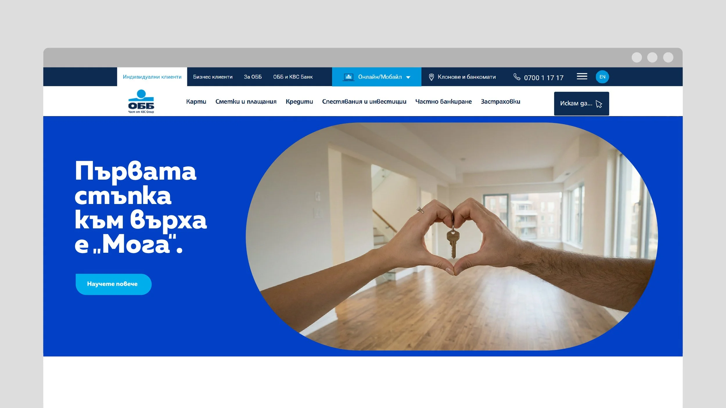
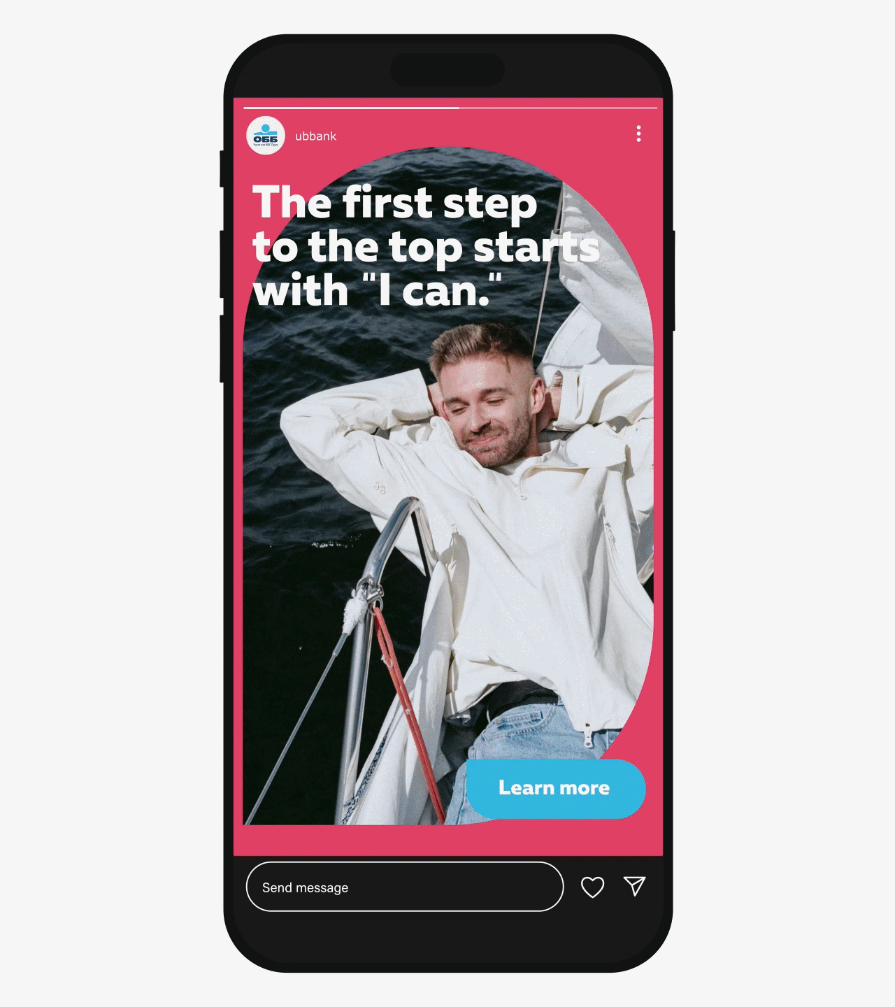
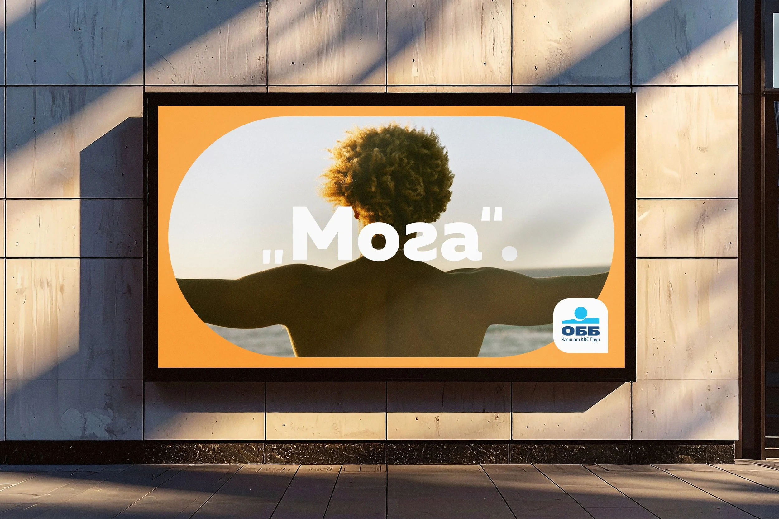
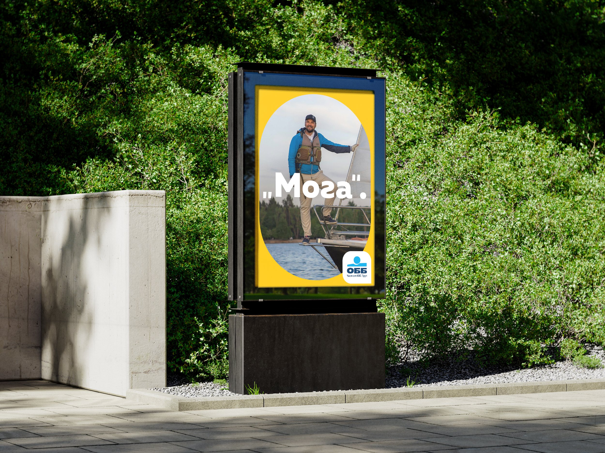
The redesigned system resolved the initial issues by ensuring that key visuals remained intact across different applications and were no longer compromised by format constraints. It also created more space for both imagery and messaging, increasing the overall visual impact. At the same time, the system became more adaptable and easier to implement across various media, supporting more efficient production workflows. Although I developed the system independently, I worked closely with the team throughout the process to refine the direction and ensure alignment with the broader creative vision.
The final outcome was a more flexible, scalable, and visually effective design system that addressed the practical challenges of the original while preserving the brand’s identity.

Sector:
Finance Banking
Year:
2024
Deliverables:
Graphic Design System for Visual Identity
Role:
Art Direction Graphic Design
Team:
HUMAN Agency
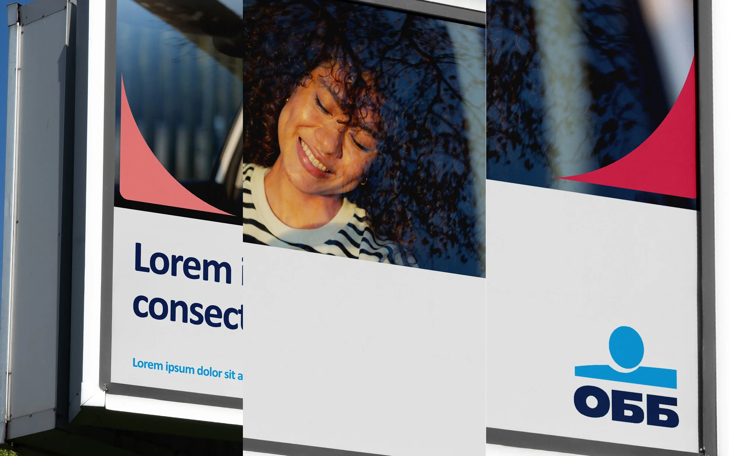
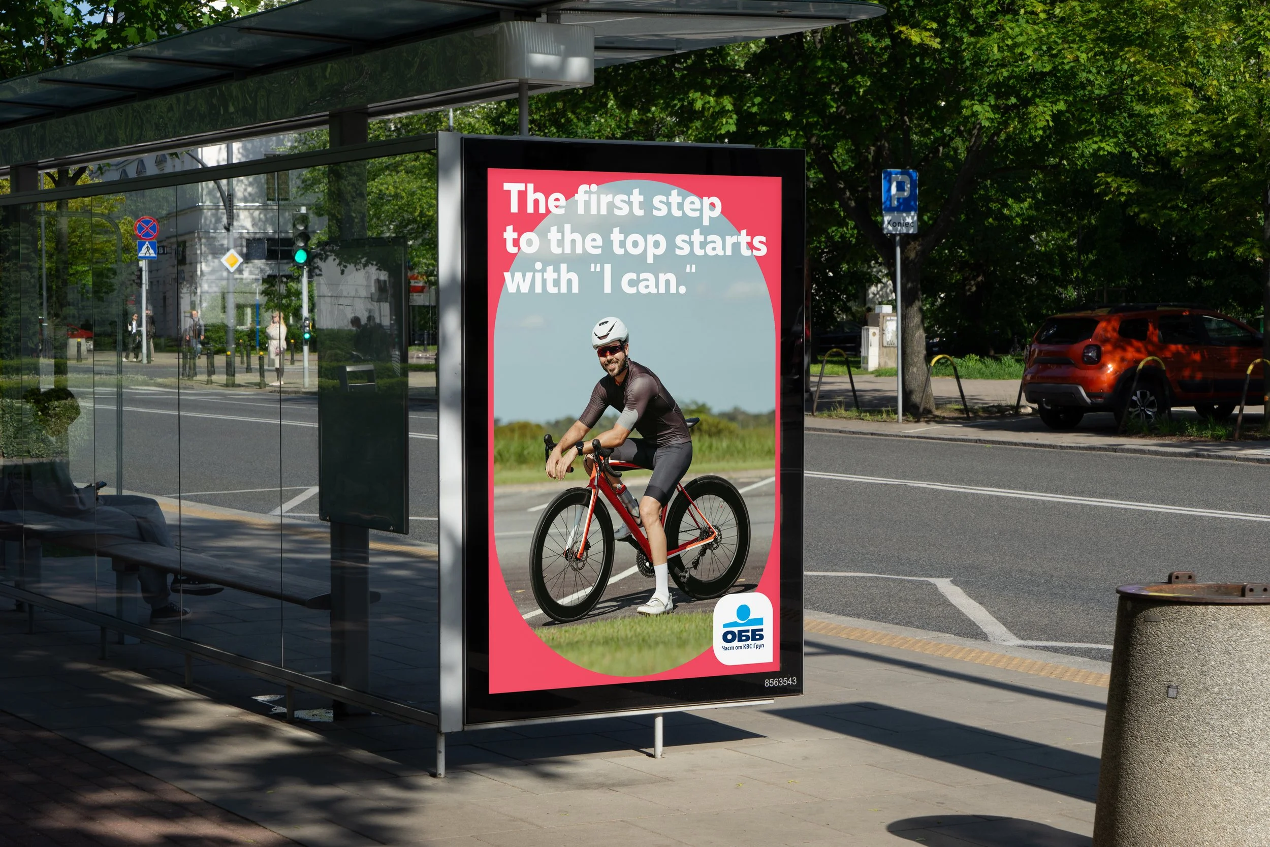
At the time, UBB already had an established visual identity system that was being applied across multiple formats. However, when used in large-scale outdoor advertising, the system began to reveal several practical and visual challenges. The composition often did not translate well to real-world placements, as parts of the graphic elements or key visuals were either unintentionally cropped or obscured by the physical structure of media holders such as billboards and citylight frames. In other cases, elements extended beyond their intended boundaries, creating compositions that felt visually unbalanced and distracting. Additionally, a large white rectangular space designated for information occupied a significant portion of the layout, limiting the presence and impact of the main visual and reducing the overall effectiveness of the communication.
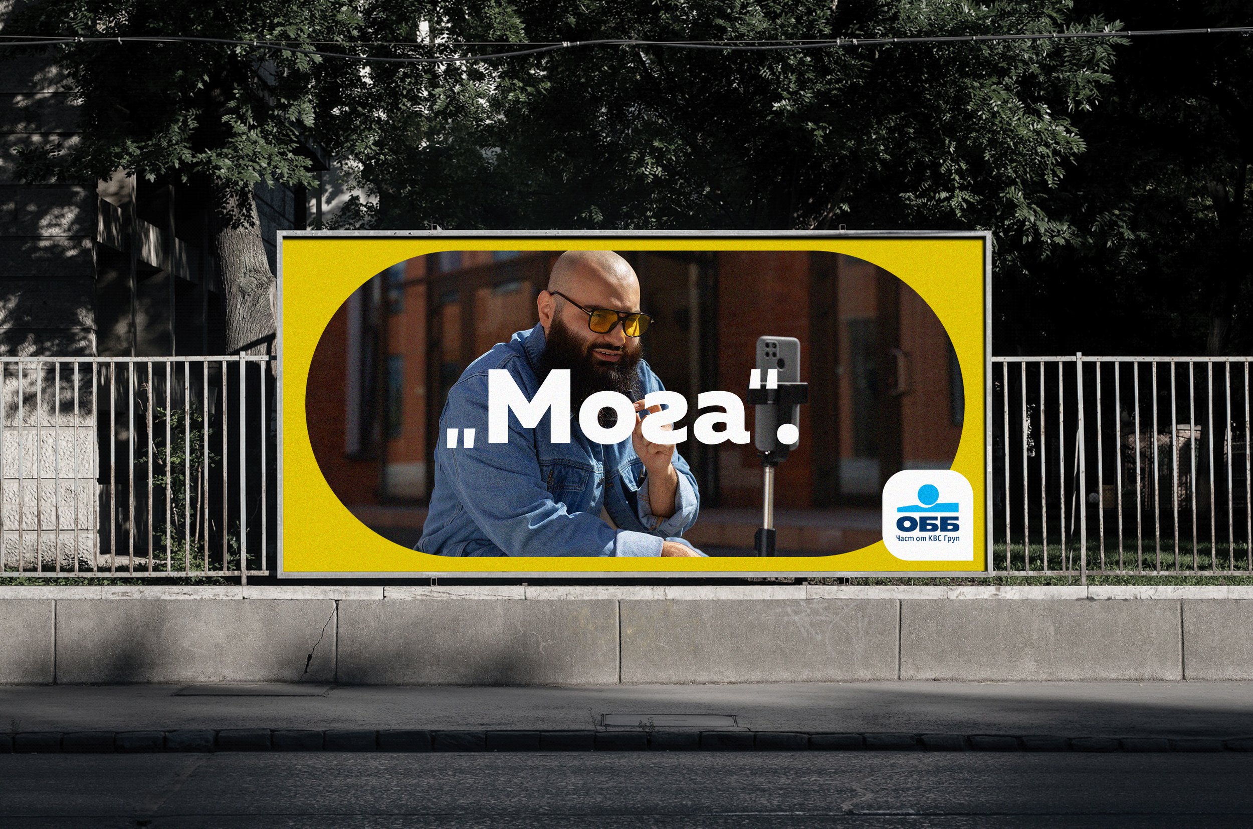
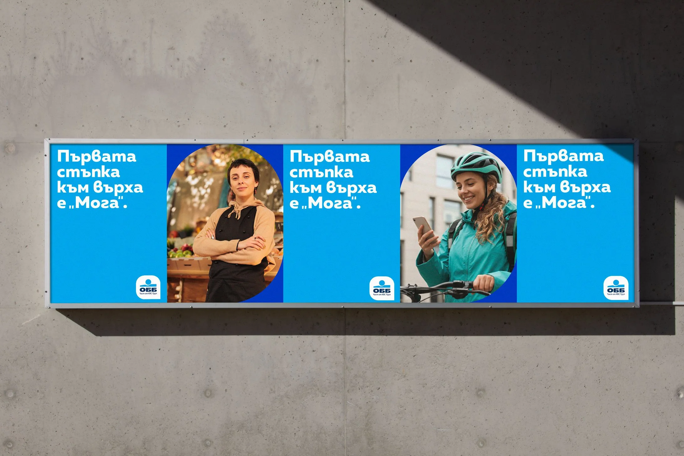
This final direction restructured the composition by repositioning the graphic elements across the visual field and introducing a unified color background that helped create a more cohesive and controlled layout. The adjustment reduced the dominance of the white information block and allowed for a better balance between text and imagery. As a result, the system became more structured and visually simplified, while maintaining the recognizability and character of the original identity. The refined use of color and typography contributed to a stronger and more distinctive visual presence, while also improving clarity and readability, particularly in large-scale formats.